Designer: Allie Tracy
Carter Bloodcare: campaign Book
In my campaigns class this past semester, I was tasked with creating a book that documented all the work my team and I completed over the semester for our client, Carter BloodCare. This book was created in Adobe InDesign. While this book was a large undertaking, I am very glad I was the one responsible for it and can confidently say that I put my all into the project.
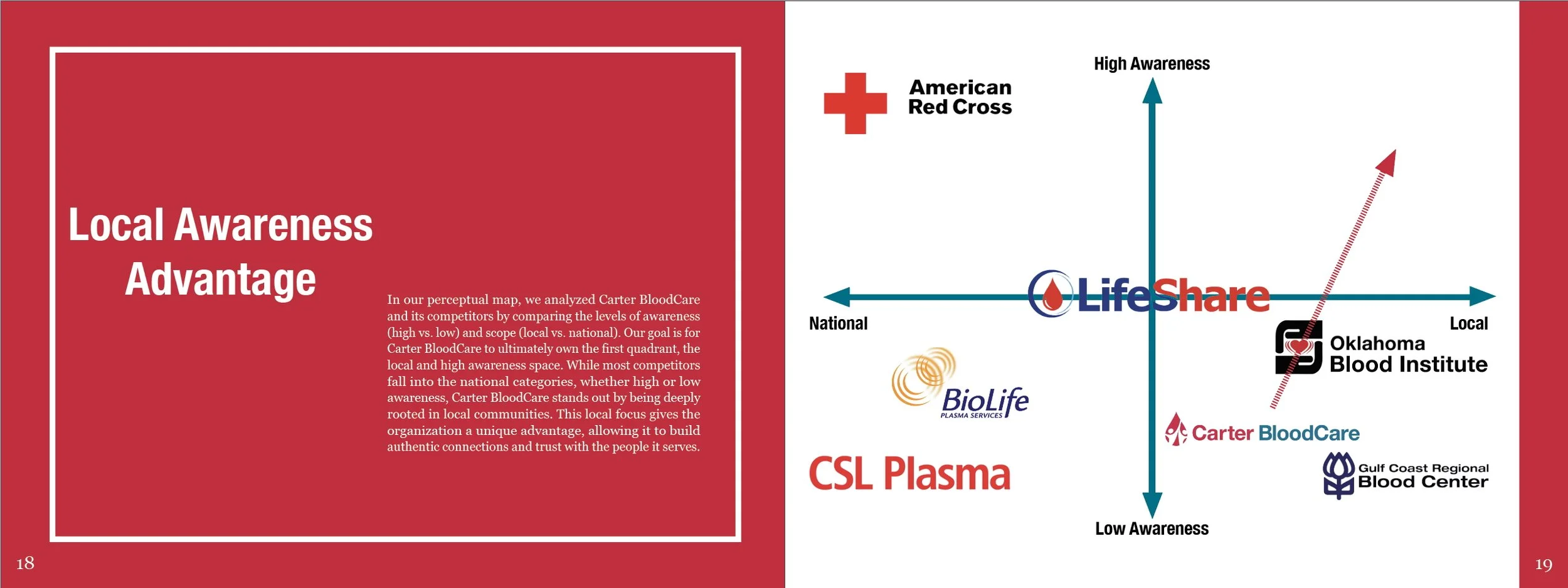
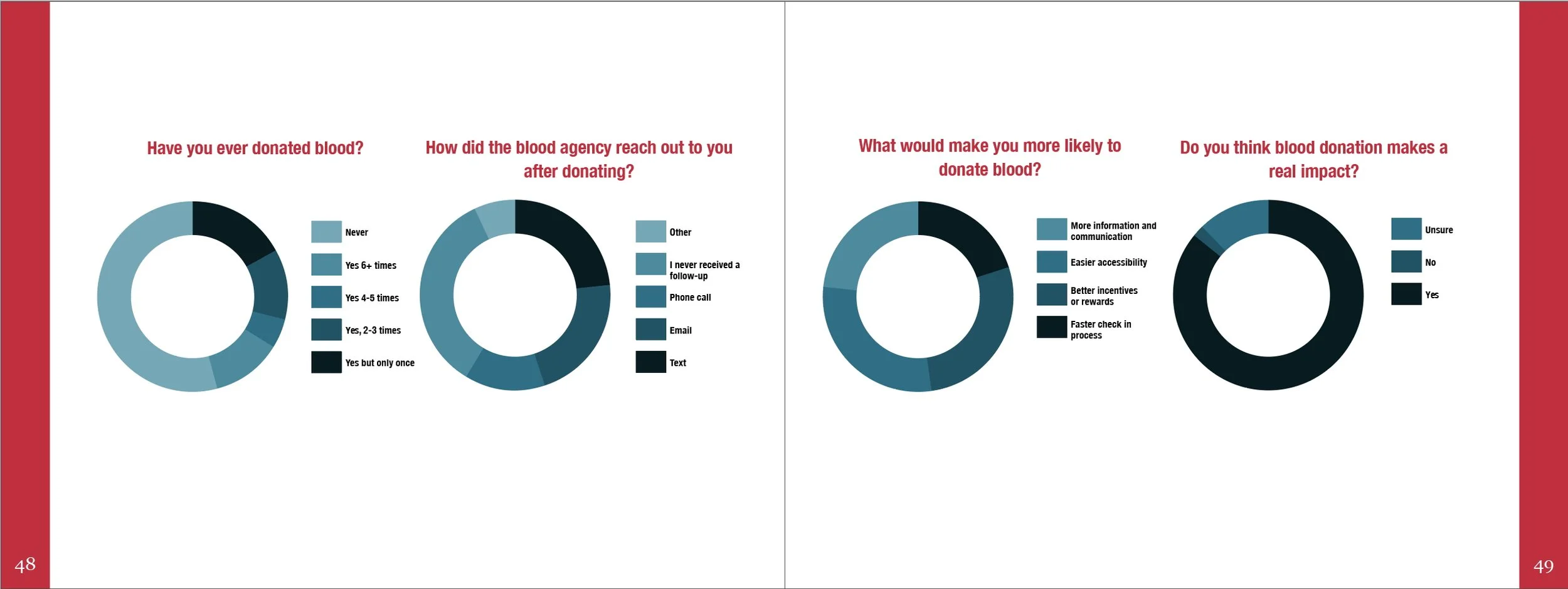
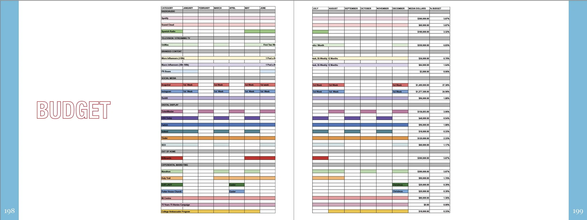
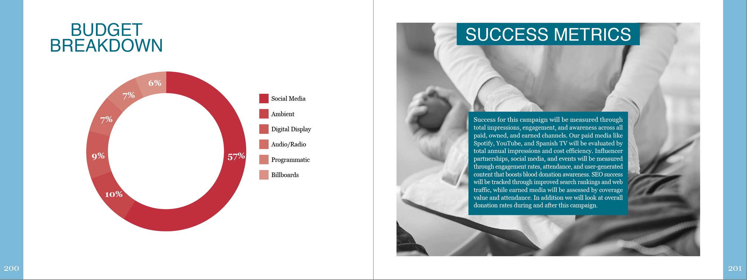
At the beginning of this project I was given a couple of pointers from my professors: make effective use of white space, have crisp images, and be consistent. I like to think I accomplished this, so I selected a few pages from the 220-page book to showcase some of my layouts, graphs I created, and portions of the project to which I contributed the most. As you will see, the budget, while not my strongest skill, was completed entirely by me. When the project was presented, I was able to answer all of Carter BloodCare’squestions regarding the budget because of the time and deliberateness I invested in it.
When I create, I do so with purpose. Every element placed has a reason. I have always been a designer who believes that every design choice should be intentional, and I make a point to find those reasons throughout the creative process. This philosophy is reflected in the tabs you see on the sides of each page (excluding the title pages). These tabs were intentionally designed so that if a client revisits the book, they can easily locate specific sections based on the color along the edge of the page.
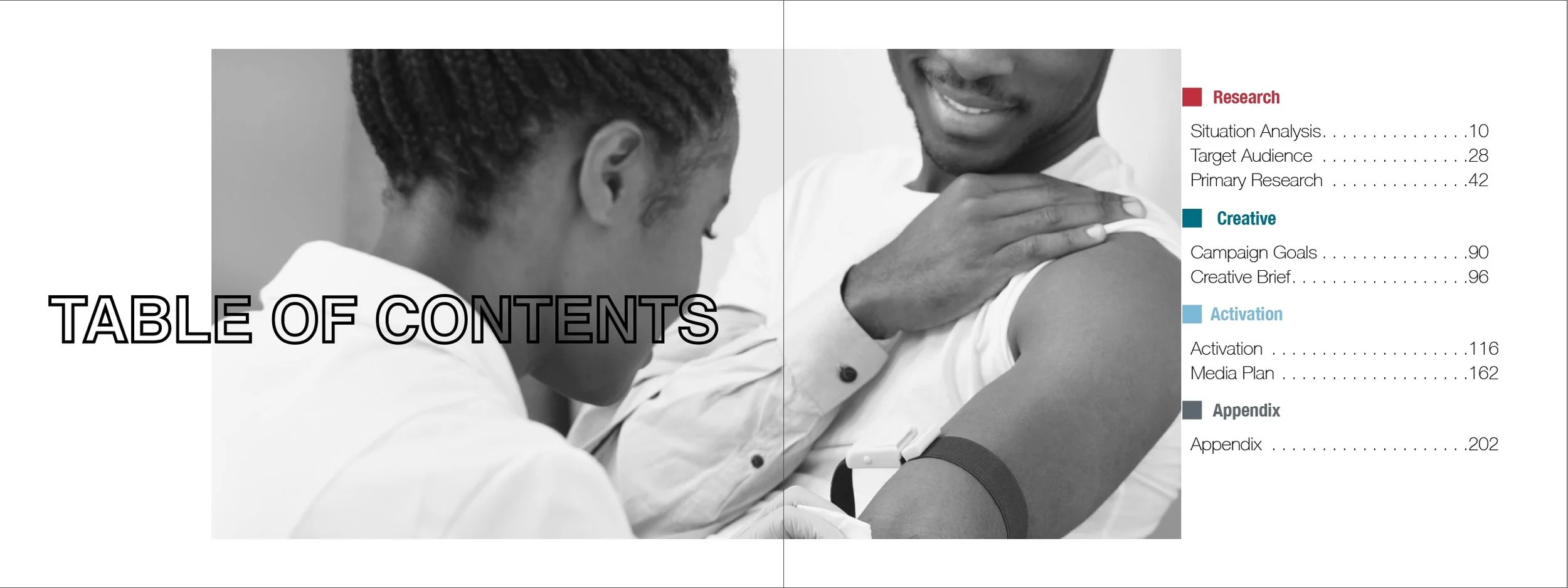
The book is divided into Research, Creative, Activation, and Appendices. The colors used throughout were pulled directly from Carter BloodCare’s brand asset page on their website. This also informed the type hierarchy. While the brand provided only two typefaces, Helvetica and Georgia, with guidance from my professor, I was able to expand their usage. All titles are set in Helvetica or Helvetica Neue, using variations of bold, black, condensed, or regular weights, while the body copy is set in Georgia, as I believe body text should be set in a serif font for readability.
Overall, while this book took a significant amount of time to complete, I am grateful I invested that time. I walked away with a final product I am incredibly proud of.